
www.hymans.co.uk
Websites have come a long way in the last few years haven’t they, with the advent of blogs, then social media and now mobile. I’ve been watching the evolution of professional service firm sites with particular interest as a lot of our clients are in this space. Some of the big firms are getting it right (I think IBM‘s content-led site is ahead of the pack), but many small to mid-sized independent companies (and much larger ones too) are struggling with websites that are still little more than static, online brochures.
There is one however one mid-sized independent business whose website consistently leads the way. UK pension and risk specialists Hymans Robertson is not a firm that likes to stand still. Their website is constantly evolving to meet the needs of today’s content-hungry audience.
In the light of yet another fabulous refresh and successful move to a fully responsive site I picked up the phone to Terri Lucas – Partner, Director of Marketing Strategy. She told me what web 3.0 means to Hymans Robertson and how every organisation can benefit from taking their website to the next level. Plenty of tips and learnings here if you’re in the process of evolving your own website.
From web 1.0 to 3.0 at Hyman Robertson

Terri Lucas
“We are constantly in the process of making some significant changes to our website. We realised last year that our website was overloaded with corporate information and that it was too structured around our own needs. It was also trying to be all things to everybody — including clients, prospects, potential employees and journalists. And that just wasn’t working.
“Our aim with 3.0 is to create a truly engaging environment that works for our visitors (regardless of device) rather than us.”
It’s interesting to look back at the evolution of our website. In terms of look and feel, our first website (1.0) was all about providing information. Our second (2.0) was more like a brochure. Our aim with 3.0 is to create a truly engaging environment that works for our visitors (regardless of device) rather than us.
By considering how visitors access our site and adapting to their needs we have been rewarded with an increase in people returning to the site.
An enticing shop window
We realised that we needed to focus. We wanted our new 3.0 website to be aimed specifically at attracting business prospects. We’re not trying to use the website to reach existing clients and staff — we have other ways to communicate with them.
“Don’t try to please all of the people all of the time. It won’t work.”
The key approach is to create a shop window that attracts like minded people to us. It’s a bit like standing in front of Selfridges. The store is packed with thousands of products but the window only has a careful edited selection, a few things that will entice you into the shop. And that shop window keeps changing.
So after careful tracking of the visitor journey, using clever analytics and website tags, we redesigned it around what our clients valued. This saw an immediate increase in the amount of time visitors spent on the website. 3.0 has to be based on user experience. So we’ve redesigned the website to give it a very strong home page that is fast-moving, featuring whatever is hot at the moment in terms of topics. And the crucial thing is not to let it get stagnant.
This approach is a big change in our thinking. We have other websites for potential employees and other specific services. The main Hymans Robertson website is all about helping people understand if we are the people that can help them with their pensions and risk issues.
Creating a responsive website
The other thing was that it was absolutely time to be responsive. Today, people expect to connect to a website 24/7, wherever they are — not just on a PC.
To do that, we hooked up with the digital agency Realise. They took us through lots of useful planning, did an audit of our current website and together we’ve made it tighter and more organised. They also helped us produce cut-down versions for tablets and smartphones.
And the results have been good. The number of visits to our website has gone up threefold.
The people factor
The other thing that we’ve learned and which we would recommend to other organisations is to get the people stuff onto your website. People buy from people, especially in services. They want to know who you are; do they like the look of you, what are your areas of expertise?
It’s vital to convey that personality, the human touch and offer up your content from the heart. It feels more interesting and relevant than content that is clouded in jargon, the kind of corporate ‘cleverness’ that just obscures the real message.
“Offer up your content from the heart.”
The other thing is images. We’re working on a project to deliver a lot more video content. It’s the human side again. We usually convey things better in person than when we write something down.
Social scene
The next step for Hymans Robertson is to fully enable the website for social channels and to promote more dialogue. Our social reach is at a very high level but there’s more we could do. You can’t rate any content on our website at the moment and we haven’t yet got into generating conversations on the site. Valuable Content a bit of a role model for us in this; it’s something we really want to figure out and facilitate.
“The next step is to full enable the website for social channels and promote more dialogue.”
It’s very much a sign of the times — people have the power, we don’t. We can offer up what we know and help people and they’ll want to engage but really it’s about whether it works for them, that’s where the real power lies.”
Terri’s top tips for creating a website 3.0
- Treat your home page as a shop window — edit carefully and keep ringing the changes.
- Focus on who your website is for — don’t try to please all of the people all of the time, it won’t work.
- Go responsive to make sure your target market can easily access your website from any device.
- Create content about your people. Use video and images to present the human face of your business.
- Take a friendly and direct approach in your content using everyday language, not a ‘posh’ corporate voice.
More from Hymans Robertson
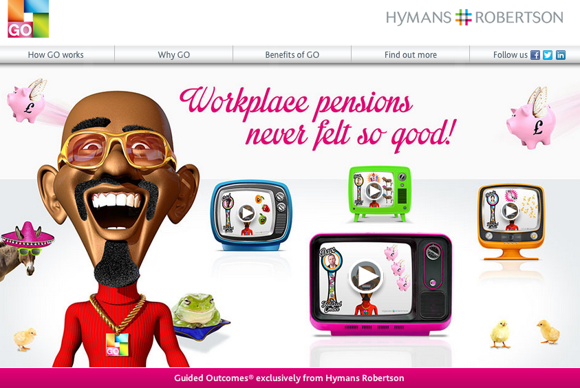
Last time we wrote about pension and risk specialists Hymans Robertson, we were giving them a Valuable Content award for their fabulous “Mr Feel-good” campaign. You can read about it here — it shows how this forward-thinking professional services firm came up with a smart, funny, creative content-led campaign that also delivered a truly impressive return on investment.
You can read about Terri’s ideas on professional services marketing in her excellent blog too – Humans Buy Services.
If you want to know more about the Hymans Robertson approach and experience do leave a comment for Terri here.
Other content you might like:
- Award for Desynit – an IT firm getting its website & content right
- Are you embarrassed by your website?
- Website audit – the first step in mastering your digital universe
- The future of websites


Trackbacks/Pingbacks